
Brand resources
Logos, colors, and type used across the site.
Open Brand StudioProfile images
Square downloads, shown with a circular profile crop below. Use the dark or light PNG for profile uploads, with upload zoom at its minimum. Cropped PNGs are for placing in designs; they do not include avatar padding.



- Default: Cropped transparent PNG · SVG · Square transparent PNG
- Empty: Cropped transparent PNG · SVG · Square transparent PNG
- Full: Cropped transparent PNG · SVG · Square transparent PNG
Platform assets
Every public profile has padded dark and light avatar downloads. Services with a documented or practical header surface also have a fitted primary alkem.dev signature and company-name alternative. Guidance marked practical needs a final crop check in that platform’s editor.
YouTube · 2560 × 1440
The centered 1544 × 423 safe area is the official 1235 × 338 minimum-canvas safe area scaled to the recommended 2560 × 1440 upload. Keep the signature there; the flask field can extend beyond it.
Avatar: Dark PNG · Light PNG · Video watermark · Platform guidance
Twitch · 1200 × 480
Twitch recommends a 1200 × 480 profile banner and asks that graphics concentrate on the left because wide browser windows can stretch the canvas.
Avatar: Dark PNG · Light PNG · Platform guidance
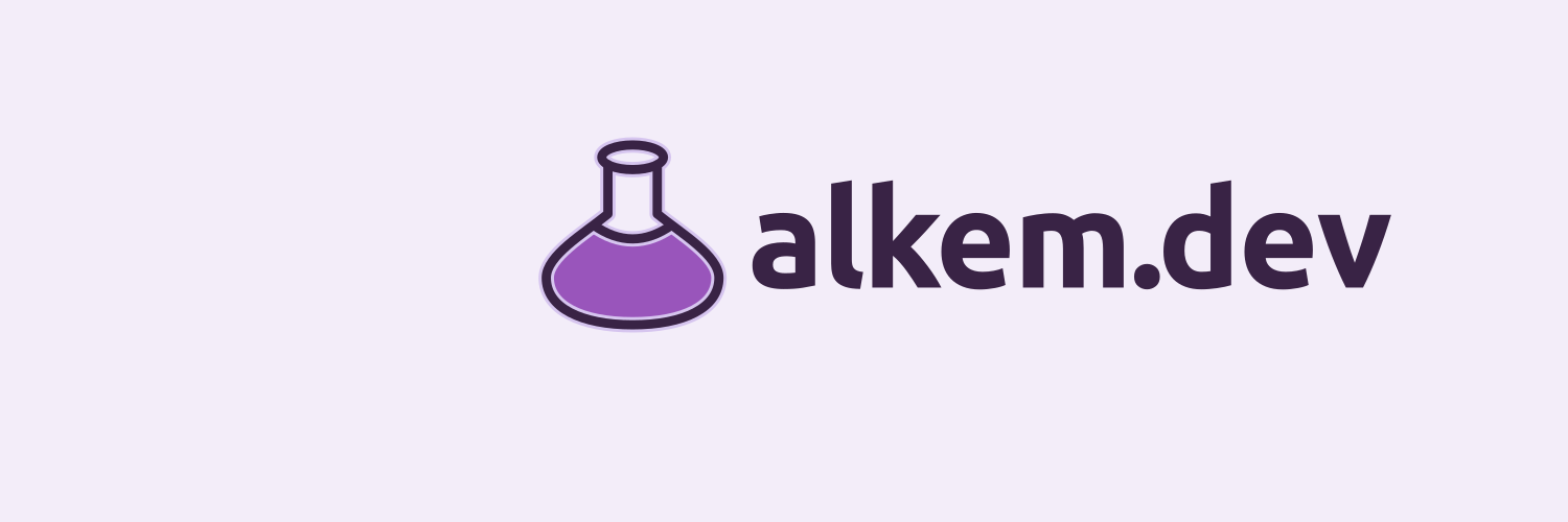
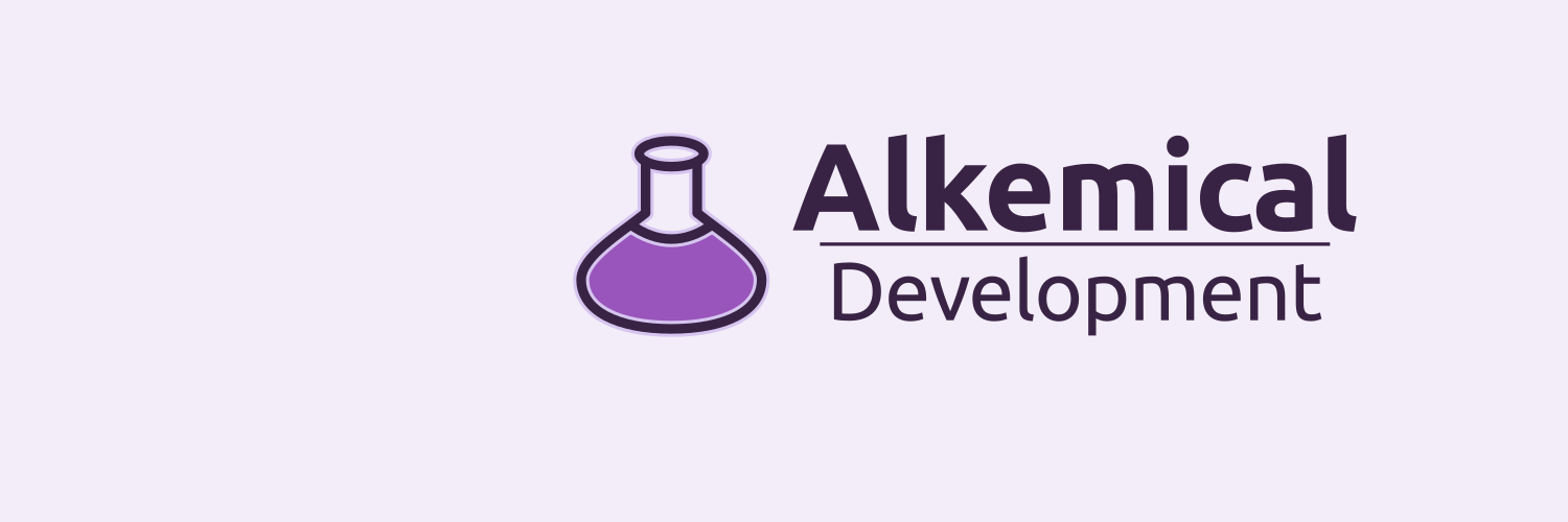
X · 1500 × 500
Signature sits right of the overlapping avatar and away from top and bottom crop edges. Check the final upload at minimum zoom.

Avatar: Dark PNG · Light PNG · Platform guidance
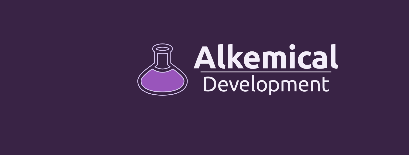
Facebook Page · 1640 × 624
A high-density 2× cover composition for the commonly rendered 820 × 312 Page surface. Meta does not publish a stable current Page-cover specification; confirm the crop in the Page editor.

Avatar: Dark PNG · Light PNG · Platform guidance
Bluesky · 1500 × 500
Bluesky's profile API supports a banner but does not specify a client canvas. This 1500 × 500 composition matches the common client presentation; verify the final upload in the app.

Avatar: Dark PNG · Light PNG · Platform guidance
Mastodon · 1500 × 500
Mastodon downscales profile headers to 1500 × 500. The composition leaves the lower-left area open for the overlapping avatar.

Avatar: Dark PNG · Light PNG · Platform guidance
LinkedIn company page · 4200 × 700
LinkedIn currently recommends a 4200 × 700 Company Page cover. The signature is deliberately right-shifted to clear the overlapping profile mark; keep it away from every edge, especially the lower-right.

Avatar: Dark PNG · Light PNG · Platform guidance
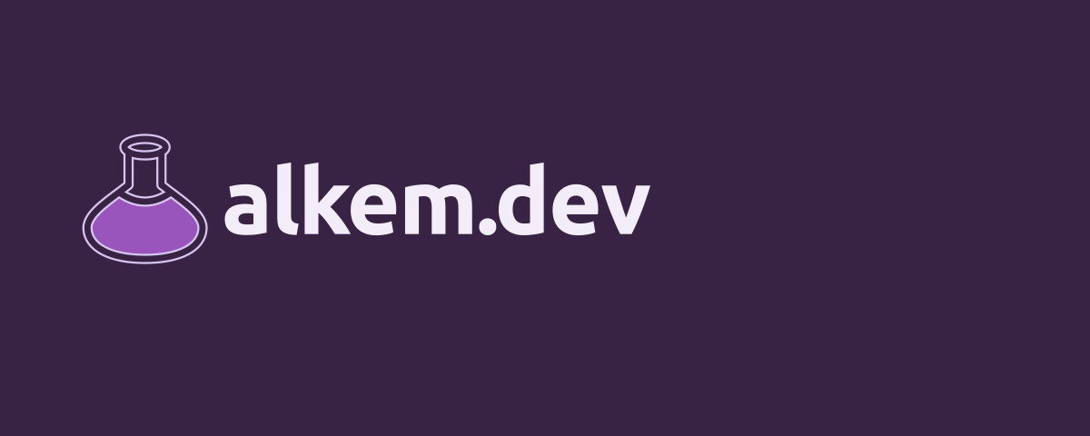
GitHub README · 1200 × 320
Our responsive organization-README composition, not a GitHub-mandated profile header. SVG light and dark variants can be selected with a picture element.
Avatar: Dark PNG · Light PNG · Platform guidance
Profile image only. Use the padded square default flask and verify Instagram's circular crop after upload.
Avatar-only profile surface.
Avatar: Dark PNG · Light PNG · Platform guidance
Reddit user profile · 1500 × 500
Reddit supports a user-profile banner but does not publish a stable current canvas. This wide header is a practical master; verify the final crop in the profile editor.

Avatar: Dark PNG · Light PNG · Platform guidance
GitLab group
Group avatar only. Use the padded square default flask so it survives small circular and square listings.
Avatar-only profile surface.
Avatar: Dark PNG · Light PNG · Platform guidance
Hugging Face organization
Organization avatar only. Use the padded square default flask and keep the profile description and verified links current in the Hub UI.
Avatar-only profile surface.
Avatar: Dark PNG · Light PNG · Platform guidance
npm user profile
This account is an npm user profile, not an organization. Use the padded square default flask where the profile UI accepts an image.
Avatar-only profile surface.
Avatar: Dark PNG · Light PNG · Platform guidance
Docker Hub organization
Organization identity centres on its permanent namespace and company name. Use the padded square default flask where the Hub profile UI accepts an image.
Avatar-only profile surface.
Avatar: Dark PNG · Light PNG · Platform guidance
alkem.dev
The flask with alkem.dev. Our compact introduction in navigation, links, and small spaces.
Company name
Two lines with a divider, for places where the full name should lead.
Flask icons

































































Preserve the proportions and give the artwork space. The transparent icons work on both surfaces; signatures have dedicated light and dark versions.
Colors
Primary
#9955BBThe main identity color.
Accent
#B9ED94Supporting color and emphasis.
Ink
#392345Lettering on light backgrounds.
Surface
#F3EDF9Light backgrounds and reversed lettering.
Highlight
#D6C5EFAn optional supporting detail.
Roles describe a job, so the palette can change without changing the system. Website text and surfaces use readable tints of these same colors.
Style specification
fav1 · version 3 is the selected identity: the outlined Halo flask with an alkem.dev primary signature.
- Flask
- 90% fill · 6px outline · 2px halo
- URL signature
- Ubuntu 700 · 42px · -0.8px tracking
- Company signature
- Ubuntu 700 · 36px · -0.4px tracking
- Detail type
- Ubuntu 400 · 24px · 120% line height
These are the source values for the outlined vector family. They scale at export; the numbers describe the style system, not fixed web CSS sizes.
Typography
Alkemical
Development
Bold in the signature and headings. Regular and medium weights for comfortable reading.
Aa Bb Cc
0123456789
Dates, labels, and code. Small details that help you find your way.